 01
01 02
02 03
03 04
04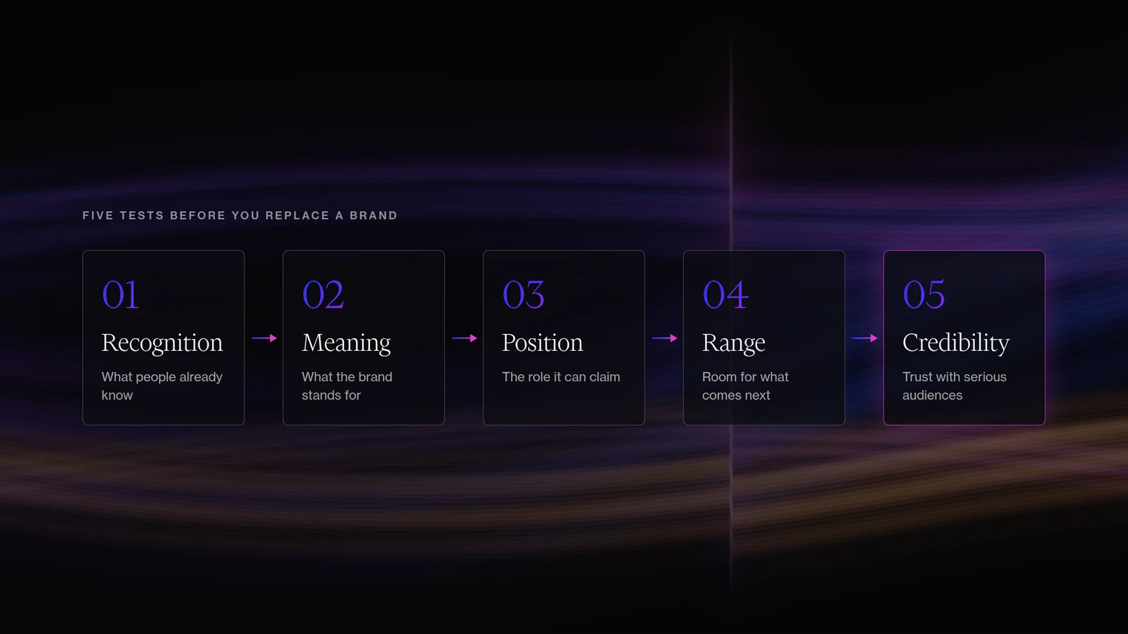
Sections
A mark may be recognised, and a colour may carry years of association. A phrase may mean something to the team, and a visual quality may still express something true about the culture. At other times the existing name or identity keeps pulling the organisation back into a role it has already left. The real question is which parts still carry useful meaning, and which parts now hold the organisation back.
Start by separating recognition from habit
A weak brand system can still contain valuable assets. Before replacing anything, we usually want to understand what is recognised, what still carries meaning, whether the current identity supports the role the organisation wants to occupy, whether the system can stretch into the next stage of products, programmes, channels and audiences, and whether it creates the level of credibility the work now requires.
Those answers give you a much better brief than "make us feel more modern". They also stop a rebrand becoming a visual purge. Continuity can be strategically valuable when it helps people understand that the organisation has matured without becoming unrecognisable.
Fair Carbon needed evolution, not erasure
The Fair Carbon brief contained several tensions at once. The organisation was becoming more credible and more complex. Its older platform held substantial information and recognised different audiences, but navigation had become difficult and the visual identity did not yet carry the authority the organisation needed as it worked across science, finance, project development, communities and carbon markets.
At the same time, the team did not want a clean break. The existing identity had recognition. The leadership also wanted the brand to retain a feminine character that felt important to Fair Carbon's culture while remaining open to the wider organisation, including the men working within it.
The design problem was therefore wider than making the organisation look more corporate. The work had to balance authority and warmth, precision and humanity, continuity and evolution, femininity and inclusivity.
The answer was to evolve the visual language. A relationship with the original mark remained. Around it, typography, colour, hierarchy, imagery and the digital experience became more credible and flexible. The organisation could enter more technical, financial and institutional settings without feeling like an entirely different company had arrived overnight.
The logo is rarely the whole decision
One reason brand evolution is often misunderstood is that the before-and-after comparison focuses on the symbol. The deeper constraints usually sit elsewhere.
The typography has to carry a serious report and a public campaign. The palette has to work in diagrams, data and interfaces, and the photography has to place the organisation in the right category. New programmes need to be distinguishable without splitting the master brand. The voice has to hold up in a board paper and a public story, and the website has to make a growing organisation easier to understand.
A logo can survive while the whole system changes around it. Equally, a new logo can arrive while the underlying brand remains exactly as limited as before. The test is whether the system has enough range for what comes next.
Sometimes a cleaner break is the more honest move
ERS sat at the other end of the spectrum. Wildsense was becoming a restoration standard in a market where institutional authority mattered, and the previous name and identity still read closer to an initiative. We recommended moving away from the Wildsense name and supported the naming process. The team selected Ecosystem Restoration Standard, and the identity, website and launch were then built around that clearer institutional role.
Fair Carbon needed continuity and ERS needed a stronger break. Both were brand strategy decisions before they became design decisions. A deeper reset becomes more rational when the name describes a role the organisation has left, recognition is low, the current identity places the company in the wrong category, or the central brand idea actively contradicts the future position.
Design against the future organisation
Judge the amount of change against the next three years of the organisation, well beyond launch week. That period may bring new products or programmes, more geographies, larger institutional partners, research or policy publications, a fundraising process, a different customer mix, a more technical sales cycle, or new collaborations or acquisitions.
If the existing identity can support that future with a stronger system around it, evolution may be enough. If the central name or idea keeps creating strategic contradiction, preserving it can become more expensive than replacing it.
A rebrand becomes strategic when the amount of change matches the problem.
Tell us what needs to move.
Bring the brief if it is clear. If it is unclear, tell us where the work is stuck.
Bring us the problem